Gone icons
What made Apple products stand apart from other 'technology' products was its human touch. When you use an Apple computer or any other Apple product you don't feel like you are a 'techie' handling a machine, you feel more like a human. The new iOS7 interface I am afraid is a departure from this fundamental quality of Apple design.
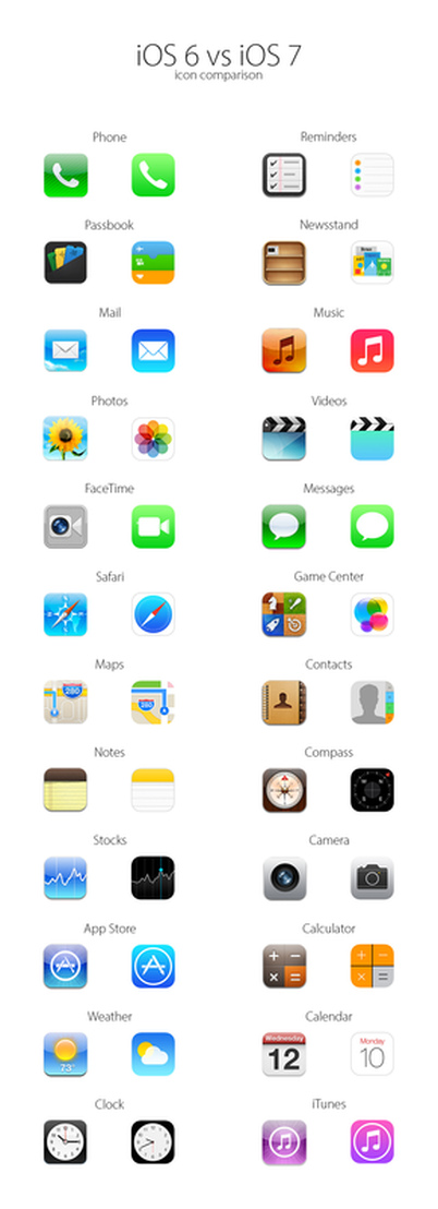
The redesigned icons are the best example. The old icons where close to real life; they were three dimensional, in real life colours and overall loveable. The new ones has something impersonal about them. They are modern and simple in graphic design terms but there is an element of human touch is missing, it looks like these icons are created out of a software which generate icons. They are designed without any love. Love is the most essential quality of an Apple design than modern graphic design feel.
Look at the new Newsstand icon, the Reminder, the Calendar? they look feel and smell of PC. I think first time in history Apple has given in for the demands of the critics, tech writers and more vocal users. Apple should have listen to themselves and stood for what they are.
Anyway this is the vision of Jonathan Ive, let's wait and see where he is taking Apple.

 RSS Feed
